Monday, March 16, 2009

Don't stop til you get enough


Can the Jackson brand rise again to the heady heights of the 80s? If tickets for his new London show are anything to go by, maybe. The ten initial dates announced at the O2 in London quickly rose to 50 by general sale, and each ticket was sold out in 11 seconds. It may have been twelve years since he last toured in the UK but baby dangling, criminal charges, court appearances and lack of music has done little damage to his popularity. There must be some worries about his performance (and that no body part flies off mid moonwalk), but if he gets it right, it will be some hell of a show. Not sure his merchandise will fare quite as well (who's gonna wear his t-shirt in public?) but when it comes down to it, the product is unbreakable and people will temporarily ignore the circus that is Brand Jacko. Aoww!

Monday, March 09, 2009

Design Week Awards


The book came through the post last week (not invited this year - pah!). Some great work as always. What immediately grabbed my attention was Johnson Banks' Mouse logo (the copyright symbol is just beautiful), Hat-Trick's Scottish Opera logo (simple, classic and therefore timeless), Purpose's christmas promotion for Greenford Press (Pantone + Food = Panettone), The Partners poster for Richard House Children's Hospice (witty and eye catching) and Pearlfisher's packaging for This Water (Innocent derivative in a good way). The digital category was a bit light, no-one was pushing the boundaries, despite what the Lynda Relph-Knight said. It's difficult to be impressed with a site and not by the technology behind it, Flash or video, and good old fashioned ideas are a bit rarer. I guess that's why Eagle Clean was the winner as there is a simple concept but it's a bit ho hum. Design Week doesn't seem to be keeping pace with digital developments.

Monday, March 02, 2009

Morph reborn!


As a subscriber to Esquire, I receive line-free versions of the magazine through my letterbox. Last month, the cover star was not either a most-lusted or most-wanted celeb, but the more understated but not underdressed Morph. He was the star of a fashion shoot, the first time he has been dressed, and his plasticine accessories (by Paul Smith, Gucci, Prada and Hermes, amongst others) were tailormade. The white leather gucci loafers were very cute.

And with Max Clifford like PR planning, he descended onto the Tate Modern for a very fashionable flash-mob to celebrate his mentor, the recently deceased Tony Hart. Tony (sadly without his sidekick, but with his agent) opened my degree show in the mid 90s and drew some pictures which were auctioned off for the college at the end of the private view. We have a frog at home somewhere.

Aardman Animations who look after Morph and Wallace and Gromit have severed their relationship with the Hollywood Sudios that funded films like Chicken Run, citing creative stiflement. Maybe its now the time to relaunch the very English superstar Morph back on our screens, but how long before he will be papped with crack and admitted to rehab?

Monday, February 23, 2009

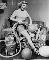
Going to do the Hoovering


Genericised trademarks are trademarks that were for specific products but have lodged so deep into consumers concious that they are often used for so much more, including a whole brand category. Hoover is an obvious example (being shorter than the more accutrate but cumbersome vacuum cleaning) - but this article is a list from A to Z. Some that you know (Photoshop now stands for any type of photo retouching) but others that are unexpected (Astro Turf, Jet Ski, Microchip). Ford tried to do it with the Ka, but you just can't force it. As usual Wikipedia have an article as well.

Wednesday, February 18, 2009

Twitterings


Just as it has hit critical mass, I (or rather we, our business Spinner) have joined the Twitterers and gone Twittering crazy at www.twitter.com/studiospinner. Great fun, and it's truly reflective of our social behaviours. Short, supposedly sharp, and badly spelt - the noughties in a nutshell. The trouble with so many blogs is that there is this presumption that everyone has the time and inclination to read an essay on your life. We haven't, though I am interested if you can grab my attention for long enough. A twitter does just that, though I can hear Stephen Fry bemoaning the erosion of our language, and he's the greatest Twitterer of them all.

Friday, February 06, 2009

James Bond


Just saw the titles for Quantum of Solace (on DVD) - rather underwhelmed by them. Keeping a balance between the iconic stylism of previous openings and producing something fresh and relevant must be a challenge, but i think they (MK12) failed. Neither sexy, innovative nor exciting. To be honest, I wasn't that keen on Casino Royale either, and there was a time when the titles were one of the most anticipated aspects of a new Bond film (with the new Bond Girls). The song's ok though.

Wednesday, October 22, 2008

Thursday, July 31, 2008

Monkey!!!!!


Jamie Hewlett and Damon Albarn have created three characters for BBC's coverage of the Beijing Olympics. The three characters are based on 'Monkey', a dubbed programme from my youth - BBC2 at about 6.30 if i remember right - and have been animated for the intro sequences. The journey from BritPop to Title Sequences seems to have been relatively straightforward for the ex-Blur frontman. Look forward to seeing them in a couple of weeks.

Sunday, July 06, 2008

Is nothing sacred?

'Designer' is now applied to a multitude of things - from sunglasses to jeans and furniture. It reached a nadir in the 90s as it was so loosely banded around even musicians wanted a piece of it (Design for Life by Manic Street Preachers, Design of a Decade by Janet Jackson). But even with the glory that design seems to bestow upon any product, I am bemused with a new sanitary towel ad - Tampax - that highlights the features by using sketches, blueprints and even the designer themselves. Obviously, I am not the target market, but a quick straw poll in the Sales residence revealed it to be rather over-egging the pudding. All products have to be 'designed' and I guess the agency/client thought that if it works for shavers and toothbrushes, it will work for sanitary towels. But what next? The science of absorbency of toilet rolls? The chemical reactions of shampoo? Er, ok, point made...

Sunday, June 29, 2008

Jump! Quick!


Though I didn't actually witness the ad spot that will change the face of UK tv advertising (damn clients and those deadlines) the jumping skydivers can be seen again on Honda's website - see link above. I imagine seeing it out of context won't evoke the same suspense as watching those guys live doing the difficult within their alloted 3mins 20 secs. However I did receive txt messages from colleagues and family who were literally moved to tears at witnessing history in the making. Most certainly an exaggeration, but advertising will become more targeted, and responding to audience behaviour in real time, much as web 3.0 is promising to do. For example, there is currently a bet365 ad that aired during a break in the European Football Championships which offers odds on the next scorer 'as of 30 seconds ago'. These real-time odds offer a tantalising glimpse of the future. Maybe this is the beginning of the end of the ad epic....

Tuesday, June 03, 2008

Mad Men through and through


This engrossing series finished last week, about the only thing i set a reminder for on tv. Of course I blindly relate to the Creative Director of Sterling Cooper, Donald Draper - effortless charisma, the bravado to turn a client away at an introductory meeting, drooling respect from everyone in the industry and the beautiful suits and accessories (maybe not the adultory). All fiction of course, but the vision of imagining campaign ideas for Lucky Strike, Richard Nixon and Kodak over an afternoon chaser - if only it was that easy - is so romantic and intoxicating, all delivered through a haze of cigarette smoke. Subtlty is key to this programme's success. Sexism is delivered through dry smiles, and the delicious irony is well hidden until the series plays out it's full set of plot twists. Can't wait for season two.

Tuesday, May 27, 2008

Four wheels for me

I need a new car but I can't find one. I mean i can find a car, any car that is practical for what i need. But i can't find a car brand that i am.

Despite all the of car brands, from alfa romeo to volkswagon, from bmw to yamaha, none of them reflect me and my aspirations. I can find clothes (Paul Smith), food supermarket (Sainsburys) or even department store (John Lewis) but a car? I am floundering. I think I might like a Ferrari, but even in that hypothetical situation (i assure you), i'm not sure, it's just a bit crass. I prefer something a bit more understated and dare i say 'cool'. But what car is cool below fifteen grand? Mazda MX4? Poor man's Porsche. A mate who's opinion on these things i value for more than any other says Renault Scenic. Really Jo? I'm not 40 quite yet, though i do have two kids.

Austin Healy or a Triumph, now you're talking. But i don't think you can get two car seats in those let alone a wife. I am going to have to grit my teeth and buy something with more plastic than my local recycling centre. That's why i am being led down a 4x4 track by my wife, and i have no resistence...

Thursday, May 22, 2008

Exploding fruit


Love this - makes me salivate. By DDB London.

Atishu! Atishu!


Another series of The Apprentice, another 'branding' challenge, this time for a box of tissues, plus a tv and press ad. The team that lost did a marginal better job visually, but even I know that Sir Alan is not a sophisticated soul when it comes to advertising and it needed to be product, product, product. And theirs was just a bit too subtle as the sorrowful pack shot was relegated to being a bit-part player. Both brand names were appealing, but of course I spend significant parts of the show drifting off to imagine what I would do. But what do I know? I'm a bloke who just won't understand the market (apparently).

Monday, May 12, 2008

Dramatic pause or over-complication?

Our future. It's in our hands.

Or

Our future is in our hands.

The former is a campaign tagline is for a government skills initiative. I find it annoying every time I see it spat from my tv – it's clunky (though admittedly it has the same number of words as the alternative) and awkward. Grammar is sacrificed for a dramatic full-stop as 'Our future' is not a sentence. Just lazy copywriting imho.

Thursday, May 08, 2008

80s film posters reborn


The new Indiana Jones film is being promoted with a huge dollop of nostalgia, looking like it could have been produced in the 80s. A montage of heads and exotic locations in an affected illustrative style – Indy has aged well. Aahh, reminds me of the Star Wars posters I had on my bedroom wall.

Thursday, May 01, 2008

Guilty pleasure...


I have just voted in the local elections (as I live in London, one of the votes is for London Major) and wish I was involved with the design of the forms, posters and supporting POS. Not glamourous, even a little dour, but the simplicity necessary is refreshing. Any way, I have a soft spot for pastel coloured papers when used together.

Note: As this is my first post in about 10 months, I must write shorter posts. Above is 62 words. In future, I will see if i can keep it to under 60.

Friday, June 08, 2007

I can't read the label...


The government has this week announced that they are planning to add information to the labels of alcoholic drinks, indicating how many 'units' they contain.

Consumers have demanded more nutritional information on their food, and graphics indicating the levels of fat, sugar and salt are are now commonplace within the supermarket chains. There is also a small graphic to remind us to eat five items of fruit a day. With the stark warnings on cigarette boxes (how can you miss them), maybe it was only a matter of time until the same thinking was applied to another of our vices.

Obviously drinks of different strengths will contain different levels of alcohol units, and successfully conveying this information to someone who may already be seeing double will obviously be a challenge - how can you subtly evoke the climate on the hills of tuscany with a rainbow-coloured pie-chart on the label? And what if I drink it by the glass, so never coming in contact with the bottle itself? I await the outcome with interest.

There is still much confusion with the unit measurement of alcohol amongst consumers, essentially because most of us are in denial about the quantity we drink. Apparently (as some bloke down the pub informed me) there is a general rule of thumb which ensures you can drink virtually as much as you want if you pace yourselves - about one unit per half hour. But we all should know that there are many factors that determine the effects of alcohol, and some clarity of information at the point of consumption can only be a good thing.

Monday, May 14, 2007

Anonymous birthday


Helvetica is celebrating it's 50th birthday. The typeface, inspired by the 1896 font Akzidenz Grotesk, was designed by Max Miedinger in 1957 in conjunction with Eduard Hoffmann for the Haas Type Foundry, in Muenchenstein, Switzerland. It is now synonymous with the Swiss style of graphic design that emerged in the 60s - thoroughly modern, with a lack of flourishes or even character that could predjudice the message in the words.

It was probably one of the most famous fonts prior to the rise of the personal computer, but since Microsoft chose to include Arial over Helvetica in their system fonts (probably to save on licensing costs) it has lost some of it's glamour. I have always felt a little self conscious when specifying Helvetica, and if i have been forced to use it to fulfil brand requirements, I have generally felt it wasn't the right occasion - there is rarely a project where I need to communicate 'uniform' or 'austere'. But since I love Swiss typography, I always have a sneaky admiration when it's used well.

Thursday, May 03, 2007

What's the fuss?


After months of media hype, yesterday saw the launch of Kate Moss' range of Clothes at Top Shop in Oxford Street, London.

Gauged by the long queues out of the shop, and the lengthy discussion on Radio 1 (yawn) the range is a success, though I fail to see the attraction myself. I use a Mac every day, but that doesn't make me an Industrial designer.

Belatedly (IMHO) recognising the brand potential, her model agency Storm commisioned a logo by by Peter Saville and typographer Paul Barnes. “Storm realised that the graphic responsibility of the brand was theirs, that we must bring it in house and then licence it to our partners, there must not be different representations of an identity of Kate Moss,” said Saville. In other words let's get in there quick so we can slap her name on anything that teenage girls buy.

Saville originally experimented with variations of Moss’ signature, but then abandoned this strategy and approached Barnes to discuss fonts. “He’s a wonderful guide to letters and was able to fast-track us to the suspects. ‘Kate’ was really easy - there were lots of fonts that worked with that. But ‘Moss’ was difficult, it kept slipping into National Trust territory or and that was completely off-message.”

Barnes then suggested a variation on Brodovitch Albro, a typeface by Alexey Brodovitch, the legendary art director of Harper’s Bazaar from 1934-58.

First impressions? Not impressed. I like the origins and that it links back to to magazines and fashion through Brodovitch's work, but that doesn't make a great logo. I generally love Saville's work, from the New Order covers to the Design Museum's web site identity, but to me this harks back to late 80s typography, all style and no substance (maybe that's the point?). It just looks clunky. Admittedly I haven't seen it in context on a size zero Mini Dress but I like to leave that type of research to my wife. Michael Johnson from Johnson Banks isn't sure either and the version they created is still available. A great alternative.

The branding of people, or people as commodities will only increase in these celebrity and ego obsessed times. Madonna has always treated herself as a brand, though without the need of a 'logo'. If there is any commercial mileage to be made from a personal badge, then it will be made. So I guess The Church will be next...