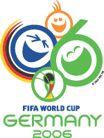
Ever since I saw it for the first time in 1982 , the World Cup emblem has been an important part of the build up to the greatest sporting event in the world. It makes the event seem more tangible as it has been (literally) years since the host country was first announced - but is the cause of my butterflies in the stomach, my sweaty palms at the thought of missed penalities and opportunities. More importantly,the emblem should also be instantly recognisable worldwide whilst being a reflection of the host nation, the spirit of the only truly global sporting competition that also the brand image of FIFA, the world governing body of football.
For the 2006 World Cup, the emblem was designed by London agency Whitestone and incorporates the german flag, the date, a vision of fun and inclusivity, and the emblem of the last World Cup in Korea through the Cup itself.
The events organiser says "We wanted to whet the appetite for what will hopefully be an upbeat FIFA World Cup. Our goal was to convey, via a symbol, the incomparable emotions that can only be evoked by football."
Unfortunately, one of the worlds greatest designers, who also happens to be German, isn't impressed. "First, there are too many messages. The original brief was: we've got to fit Germany in there, then 2006, then FIFA, plus we've got to have some happy people in there, we need green for the lawn, we've got the German national colors. So there's green and black and red and yellow and happy faces and FIFA, just way too many messages. You can look at this and count the elements and it just flies in the face of effective communication." says Erik Spiekermann, founder of MetaDesign. "Don't give up your day job" is his message to the designers. Harsh words indeed.
For me, I am little disappointed and agree that there are too many elements, and the cartoon faces are a little superficial and trite. The german colours seem to be just bolted on as an after thought. Germany has a fantastic tradition in graphic design and the arts, and I guess that Spiekermann is frustrated that it doesn't follow in those fantastic footsteps. But maybe that's because it wasn't done by a German agency...


