Tuesday, May 30, 2006

Bouncing fruit


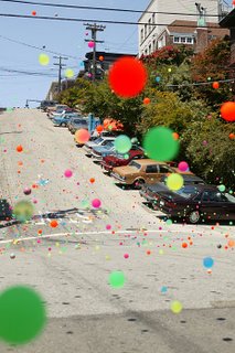
I have just seen this viral by Tango - the ad is impressive in itself, but the website is so close to the line, you're not sure what you are reading. Its just the occasional slice of copy (the Swansea North Yodelling Club, the 14 children of the Vice President) that eventually persuade you it's a fake.

There is a short feature in June 2006's Creative Review describing the shoot - they obtained the blessing of the creative team at Fallon who did the original Sony Bravia spot, and Jose González who supplied the music.

Though the Sony Bravia ad has just won two Silver D&AD awards, an ad is not really deemed a success unless its been spoofed. This is a good un.

Monday, May 22, 2006

Hitting the right note

Whilst reading my regular copy of Time Out, the city listings guide, my eyes were drawn to a full page advert for Ronnie Scotts Jazz Club and their listings of bookings for the next month or so. The irregular boxes of different but similar colours reminded me of the great Blue Note album covers - it transpires that Ronnie Scotts has a new brand identity, designed by Bloom Design.

The logo contains a drawing of Ronnie Scott himself playing the saxaphone, in deference to the world renowned figurehead who ran the club until he died in 1996. It successfully brings together the iconic cool of those striking covers by Reid Miles with a more contemporary visual interpretation of jazz (though I am not completely in love with the illustration - it has a tentative foot in both figurative or graphic camps without being committed either way).

I have often meant to go, but never have - I was repeatedly told that the food didn't live up to the quality of the music. I hope that this new Brand Identity does.

Tuesday, May 02, 2006

SOCA visual identity

I am a bit late to this (as usual), but the British goverment has created a new department called SOCA - Serious Organised Crime Agency. There is more than a little of our American friends in this - not just in name and purpose, but in visual style as well. The identity and website has come straight out of Mission Impossible, and I mean the first film - all quasi-futuristic fonts, drop shadows, gloobe iconography and metal skins. I can see Tom Cruise franticly trying to crack the password to access SOCA's high security data. To show it means business and is truly 'serious', the brand guys felt the need to quite literally show their teeth, but instead it looks like it's come out of hollywood. It has become a pastiche of a covert goverment agency, straight from a videogame.

I believe that any criticsm of other creative work on this Blog should aim to be as objective as possible. This will no doubt prove difficult when I will probably have no information on the brief, and therefore little sense of context. Equally, I do not want to use this as an excuse for not offering an opinion. Sometimes this may also prove to be a hard position to adopt.

Vodafone in 3d


Vodafone have amended their Brandmark - its more of a tweak than a wholesale change, but as seems to be the trend increasingly nowadays, Vodafone have gone 3d. Look at UPS. A simple graphic logo has been re-designed with high and lowlights. Is it that flat is boring, and having a suggestion of depth is modern?

Some of the feedback I have read has been quite dismissive of the trend. 'There has been little consideration for all the forms of reproduction' is a common criticsm. See SonyEricsson. Or 3. I don't completely share this view - new communication  channels have created new opportunities for brand expression whilst some older forms will eventually become extinct. For example, the quality of print reproduction has improved considerably over the past 40 years, as has the means of realising identity programmes. As society's visual terms of reference change, brand identities will change in tandem, maximising the potential of these new developments.