Tuesday, May 30, 2006

Bouncing fruit


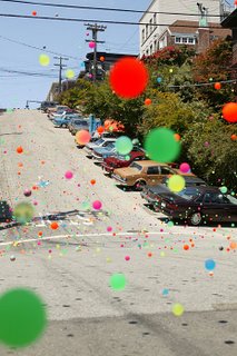
I have just seen this viral by Tango - the ad is impressive in itself, but the website is so close to the line, you're not sure what you are reading. Its just the occasional slice of copy (the Swansea North Yodelling Club, the 14 children of the Vice President) that eventually persuade you it's a fake.

There is a short feature in June 2006's Creative Review describing the shoot - they obtained the blessing of the creative team at Fallon who did the original Sony Bravia spot, and Jose González who supplied the music.

Though the Sony Bravia ad has just won two Silver D&AD awards, an ad is not really deemed a success unless its been spoofed. This is a good un.

Monday, May 22, 2006

Hitting the right note

Whilst reading my regular copy of Time Out, the city listings guide, my eyes were drawn to a full page advert for Ronnie Scotts Jazz Club and their listings of bookings for the next month or so. The irregular boxes of different but similar colours reminded me of the great Blue Note album covers - it transpires that Ronnie Scotts has a new brand identity, designed by Bloom Design.

The logo contains a drawing of Ronnie Scott himself playing the saxaphone, in deference to the world renowned figurehead who ran the club until he died in 1996. It successfully brings together the iconic cool of those striking covers by Reid Miles with a more contemporary visual interpretation of jazz (though I am not completely in love with the illustration - it has a tentative foot in both figurative or graphic camps without being committed either way).

I have often meant to go, but never have - I was repeatedly told that the food didn't live up to the quality of the music. I hope that this new Brand Identity does.

Tuesday, May 02, 2006

SOCA visual identity

I am a bit late to this (as usual), but the British goverment has created a new department called SOCA - Serious Organised Crime Agency. There is more than a little of our American friends in this - not just in name and purpose, but in visual style as well. The identity and website has come straight out of Mission Impossible, and I mean the first film - all quasi-futuristic fonts, drop shadows, gloobe iconography and metal skins. I can see Tom Cruise franticly trying to crack the password to access SOCA's high security data. To show it means business and is truly 'serious', the brand guys felt the need to quite literally show their teeth, but instead it looks like it's come out of hollywood. It has become a pastiche of a covert goverment agency, straight from a videogame.

I believe that any criticsm of other creative work on this Blog should aim to be as objective as possible. This will no doubt prove difficult when I will probably have no information on the brief, and therefore little sense of context. Equally, I do not want to use this as an excuse for not offering an opinion. Sometimes this may also prove to be a hard position to adopt.

Vodafone in 3d


Vodafone have amended their Brandmark - its more of a tweak than a wholesale change, but as seems to be the trend increasingly nowadays, Vodafone have gone 3d. Look at UPS. A simple graphic logo has been re-designed with high and lowlights. Is it that flat is boring, and having a suggestion of depth is modern?

Some of the feedback I have read has been quite dismissive of the trend. 'There has been little consideration for all the forms of reproduction' is a common criticsm. See SonyEricsson. Or 3. I don't completely share this view - new communication  channels have created new opportunities for brand expression whilst some older forms will eventually become extinct. For example, the quality of print reproduction has improved considerably over the past 40 years, as has the means of realising identity programmes. As society's visual terms of reference change, brand identities will change in tandem, maximising the potential of these new developments.

Wednesday, March 29, 2006

This place stinks

My great mate Jo at BBDO has produced an ad spot for Airwaves - fantastic as always. It uses the existing strapline 'Come to your senses', and features a little martian fella who imagines what life will really be like on planet earth. How true...

It made me laugh - on your tv screens today.

Monday, March 27, 2006

iLess is iMore

I might be a bit late on this one, but here is a great parody illustrating the fundamental differences between the Apple and Microsoft brands.

It shows how Microsoft would design and package an iPod box. So true.

Thursday, March 23, 2006

Beastie film

In a great from of consumer empowerment, the Beastie Boys gave a load of camera to fans at their concert, Madison Gardens I think, with the brief to capture the concert as it meant to them, and to record what they saw. The resulting footage was edited into a film "Awesome, I Fucking Shot That!"

Great idea - look forward to seeing the result.

The other Cezanne in my life


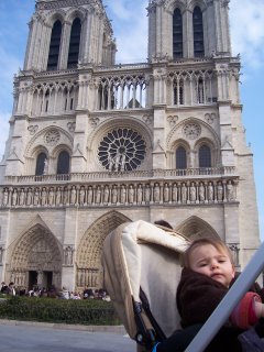
The family have just got back from a long weekend in Paris - all three of us - and an amazing time was had by all. Particularly Agnes, as she was up each night till gone eleven. Suzanne and I were shattered.

Paris is an amazing city, around every corner there is something beautiful and exciting to discover (a cliche is a cliche cos it's true). It's also so compact we walked everywhere from our base in the Marais district and didn't need to take the metro once (just as well, cos the bugaboo wouldn't have got down there).

The highlight had to be the Musee D'Orsay which, to my shame, I had never been to before. The giant space in the centre draws comparisons to the the Tate Modern, but the integration of all the other work is so much more successful. Of course, it helps that there is an Ingres scattered here and a Monet dotted there, but the juxtoposition of the contemporary and history of the architecture is breathtaking.

There is a temporary exhibition of Cezanne and Pisarro which is just drawing to a close. My A-Level Art teacher worshipped Cezanne and he often brought out a well thumbed monogram, describing the application of the paint to fruit within his still-lifes. This exhibition brought the memories back, and I realised with a jolt the inspiration he has provided, particularly through his approach to painting - to me he sacrifices figurative detail for a broad, holistic vision. And there is so much energy in his work, and possibly frustration in the application of the paint that i recognise.

Probably my first creative hero, and though I don't think of his work very often, his shadow looms large over me still.

Thursday, March 16, 2006

You copycat

According to Brand Republic, the band Groovecutters is claiming the latest ad for French Connection is a rip-off the video for their top 40 hit 'We Close Our Eyes'.

Appropriation vs Inspiration vs Skulduggery tends to be rather a subjective topic in design and advertising circles, but it seems there can be no claims of innocence here as they used the same models. And choreography. And editing. AND DIRECTOR!

This is different to the dispute about the dancing man in the Guiness ad. Relatively unknown Norwegian film director Mehdi Norowzian claimed he approached Guinness or the Agency with an idea for a spot, which was rejected but then produced. He went to court, and lost, having to pay costs of £200,000. Or the Swiss artists who claim the genius Honda ad by Wieden & Kennedy was a rip off of their short film 'Der Lauf Der Dinge'.

This video however, would have been shown on MTV, terrestrial tv and all across Europe - surely it was inevitable that someone would have seen the two and made a link. If you are going to be 'inspired' by some other cultural icon at least let a comfortable period elapse, so it will seen with something approaching fresh eyes. But the same director? PURlease...

PS We Close our Eyes was originally a hit for Go West - the first band I saw in concert, at the Hammersmith Apollo as it is now known, in about 1987. When synths in the shape of guitars ruled the world.

Monday, March 13, 2006

A real life Homer

The Simpsons opening credits have been painstakingly reinacted by actors in an exact frame-by-frame real life version - go here.

I think its a viral promo by Sky who hold most of the broadcasting rights in the UK.

Great fun.

Friday, March 10, 2006

Brand extensions

In December last year, TippingSprung produced their Second Annual Brand-Extension Survey. From a survey of 27,000 marketing professionals, Iams Pet Insurance was voted overall winner. Harley-Davidson cake decoration kits (!) was voted worst. The brand from which most respondents would like to see extensions was Apple.

Here in the UK, Heinz has moved into other tomato based products - from beans, soups and condiments they now produce canned tomatoes. To me, that seems a logical extension as they completely own the red 'fruit' in a can. And am I right in saying that I have seen Heinz pizzas? Again, a good extension though they make difficulty dislodging anything Italian.

But I have always had a difficulty with Porsche and their Cayenne model and BMW, to a lesser extent, with their X3 model. You just can't have sporty and 4x4 in one brand and be believable.

Apple is a great brand, with such a loyal customer base they could enter into many things and be successful. I for one would buy their garden hose. Or eggcup.

Thursday, March 09, 2006

DBA Design Effectiveness Winner

I have just seen the overall winner for the DBA Design Effectiveness Awards - a series of posters by Lucid for the National Patient Safety Agency. These awards are based on success by delivering to the clients bottom line - this campaign delivered a 241% increase in hand hygiene. Whatever the statistics, it neatly represents two of the principle things that I really value in a design solution; a great idea, implemented well.

Wednesday, March 08, 2006

Selling illustration to clients


I had someone from NB Illustration come into the agency this afternoon to show the studio their book. Everytime we have an illustrator or agent come and visit, we all come away feeling inspired and reinvigorated.

I always talk about the challenge of selling illustration into clients, and that I feel they often really need to see what they are going to get from the off. It's the banana story - you can have a portfolio full of drawings of different fruit, but if the client wants a banana, and there isn't a banana, well, we just can't take it any further. This takes away the magic that illustration brings to the project, the fresh interpretation of the brief. However I still feel that its up to me, as a Creative Director, to do a better job if I am to do more work with the many excellent illustrators out there.

There were so much great stuff in there, but I was drawn back to the Linocuts by Ian Phillips. Generally, I seem to be drawn to the graphic and digital work, so maybe this was a reaction against this, to the more tactile and nostalgic. It reminded me of an Adnams beer campaign. The subject matter really suits that style, lazy walks on a British beach. In the rain.

My blogging inspiration

I would like to give a quick shout to American Copywriter.

I don't know if those of us on this side of the Atlantic have been slow to pick up on the podcast and blogging thing (but when we do, we go for it, see; Ricky Gervais), but I cam across their podcast last year and these two ad men have entertained and informed me ever since.

I guess I am going to follow their lead and probably pass on some of their mutterings, whilst adding a few incoherent of my own. I am only clinging onto their Superbowl references...

But check out their blog and podcast (itunes etc) - always got something to say worth listening to.

Tuesday, March 07, 2006

Bloggin hell...

Ok, after quite a few days of hell in trying to set this thing up, I can at last post my first blog. I tried to point it at some free web space I have, but it kept giving me error messages and not letting me ftp changes, so I have given up and am using Blogger's free space.

I (eventually) intend to put it all on a new domain name, hosted elsewhere, but one baby step at a time. After all, this is all new to me.

My name is Ryan Sales. I am a Creative Director of a graphic design agency in London, and hope to use this Blog as a vehicle to talk about various design, advertising, branding, but at the very least cultural topics that catch my eye. And from this I hope to get comments and reactions to what I say, and equally hope to improve my own understanding of the visual environment I live within.

I must admit, its going to be strange, as I am not used to writing about myself, in this form - the most I ever write nowadays is when writing a rationale on my work, or trying to defend, in an email, why I have changed the colour of their logo. Just joshing.

It's now late on Tuesday night after watching Chelsea wimper out of the Champions League, and so I am going to cut this, my first post, a bit short. I intend to post at least once a week, but I will see how it goes.

Hope to read some interesting posts from the rest of the world, and relay anything relevant to me to a load of different people. Should be fun.