
I need a new car but I can't find one. I mean i can find a car, any car that is practical for what i need. But i can't find a car brand that i am.
Despite all the of car brands, from alfa romeo to volkswagon, from bmw to yamaha, none of them reflect me and my aspirations. I can find clothes (Paul Smith), food supermarket (Sainsburys) or even department store (John Lewis) but a car? I am floundering. I think I might like a Ferrari, but even in that hypothetical situation (i assure you), i'm not sure, it's just a bit crass. I prefer something a bit more understated and dare i say 'cool'. But what car is cool below fifteen grand? Mazda MX4? Poor man's Porsche. A mate who's opinion on these things i value for more than any other says Renault Scenic. Really Jo? I'm not 40 quite yet, though i do have two kids.
Austin Healy or a Triumph, now you're talking. But i don't think you can get two car seats in those let alone a wife. I am going to have to grit my teeth and buy something with more plastic than my local recycling centre. That's why i am being led down a 4x4 track by my wife, and i have no resistence...
Tuesday, May 27, 2008


Thursday, May 22, 2008

Atishu! Atishu!

Another series of The Apprentice, another 'branding' challenge, this time for a box of tissues, plus a tv and press ad. The team that lost did a marginal better job visually, but even I know that Sir Alan is not a sophisticated soul when it comes to advertising and it needed to be product, product, product. And theirs was just a bit too subtle as the sorrowful pack shot was relegated to being a bit-part player. Both brand names were appealing, but of course I spend significant parts of the show drifting off to imagine what I would do. But what do I know? I'm a bloke who just won't understand the market (apparently).
Monday, May 12, 2008
Dramatic pause or over-complication?
Our future. It's in our hands.
Or
Our future is in our hands.
The former is a campaign tagline is for a government skills initiative. I find it annoying every time I see it spat from my tv – it's clunky (though admittedly it has the same number of words as the alternative) and awkward. Grammar is sacrificed for a dramatic full-stop as 'Our future' is not a sentence. Just lazy copywriting imho.
Or
Our future is in our hands.
The former is a campaign tagline is for a government skills initiative. I find it annoying every time I see it spat from my tv – it's clunky (though admittedly it has the same number of words as the alternative) and awkward. Grammar is sacrificed for a dramatic full-stop as 'Our future' is not a sentence. Just lazy copywriting imho.
Thursday, May 08, 2008
80s film posters reborn

The new Indiana Jones film is being promoted with a huge dollop of nostalgia, looking like it could have been produced in the 80s. A montage of heads and exotic locations in an affected illustrative style – Indy has aged well. Aahh, reminds me of the Star Wars posters I had on my bedroom wall.
Thursday, May 01, 2008
Guilty pleasure...

I have just voted in the local elections (as I live in London, one of the votes is for London Major) and wish I was involved with the design of the forms, posters and supporting POS. Not glamourous, even a little dour, but the simplicity necessary is refreshing. Any way, I have a soft spot for pastel coloured papers when used together.
Note: As this is my first post in about 10 months, I must write shorter posts. Above is 62 words. In future, I will see if i can keep it to under 60.
Friday, June 08, 2007
I can't read the label...

The government has this week announced that they are planning to add information to the labels of alcoholic drinks, indicating how many 'units' they contain.
Consumers have demanded more nutritional information on their food, and graphics indicating the levels of fat, sugar and salt are are now commonplace within the supermarket chains. There is also a small graphic to remind us to eat five items of fruit a day. With the stark warnings on cigarette boxes (how can you miss them), maybe it was only a matter of time until the same thinking was applied to another of our vices.
Obviously drinks of different strengths will contain different levels of alcohol units, and successfully conveying this information to someone who may already be seeing double will obviously be a challenge - how can you subtly evoke the climate on the hills of tuscany with a rainbow-coloured pie-chart on the label? And what if I drink it by the glass, so never coming in contact with the bottle itself? I await the outcome with interest.
There is still much confusion with the unit measurement of alcohol amongst consumers, essentially because most of us are in denial about the quantity we drink. Apparently (as some bloke down the pub informed me) there is a general rule of thumb which ensures you can drink virtually as much as you want if you pace yourselves - about one unit per half hour. But we all should know that there are many factors that determine the effects of alcohol, and some clarity of information at the point of consumption can only be a good thing.
Monday, May 14, 2007
Anonymous birthday

Helvetica is celebrating it's 50th birthday. The typeface, inspired by the 1896 font Akzidenz Grotesk, was designed by Max Miedinger in 1957 in conjunction with Eduard Hoffmann for the Haas Type Foundry, in Muenchenstein, Switzerland. It is now synonymous with the Swiss style of graphic design that emerged in the 60s - thoroughly modern, with a lack of flourishes or even character that could predjudice the message in the words.
It was probably one of the most famous fonts prior to the rise of the personal computer, but since Microsoft chose to include Arial over Helvetica in their system fonts (probably to save on licensing costs) it has lost some of it's glamour. I have always felt a little self conscious when specifying Helvetica, and if i have been forced to use it to fulfil brand requirements, I have generally felt it wasn't the right occasion - there is rarely a project where I need to communicate 'uniform' or 'austere'. But since I love Swiss typography, I always have a sneaky admiration when it's used well.
Thursday, May 03, 2007
What's the fuss?

After months of media hype, yesterday saw the launch of Kate Moss' range of Clothes at Top Shop in Oxford Street, London.
Gauged by the long queues out of the shop, and the lengthy discussion on Radio 1 (yawn) the range is a success, though I fail to see the attraction myself. I use a Mac every day, but that doesn't make me an Industrial designer.
Belatedly (IMHO) recognising the brand potential, her model agency Storm commisioned a logo by by Peter Saville and typographer Paul Barnes. “Storm realised that the graphic responsibility of the brand was theirs, that we must bring it in house and then licence it to our partners, there must not be different representations of an identity of Kate Moss,” said Saville. In other words let's get in there quick so we can slap her name on anything that teenage girls buy.
Saville originally experimented with variations of Moss’ signature, but then abandoned this strategy and approached Barnes to discuss fonts. “He’s a wonderful guide to letters and was able to fast-track us to the suspects. ‘Kate’ was really easy - there were lots of fonts that worked with that. But ‘Moss’ was difficult, it kept slipping into National Trust territory or and that was completely off-message.”
Barnes then suggested a variation on Brodovitch Albro, a typeface by Alexey Brodovitch, the legendary art director of Harper’s Bazaar from 1934-58.
First impressions? Not impressed. I like the origins and that it links back to to magazines and fashion through Brodovitch's work, but that doesn't make a great logo. I generally love Saville's work, from the New Order covers to the Design Museum's web site identity, but to me this harks back to late 80s typography, all style and no substance (maybe that's the point?). It just looks clunky. Admittedly I haven't seen it in context on a size zero Mini Dress but I like to leave that type of research to my wife. Michael Johnson from Johnson Banks isn't sure either and the version they created is still available. A great alternative.
The branding of people, or people as commodities will only increase in these celebrity and ego obsessed times. Madonna has always treated herself as a brand, though without the need of a 'logo'. If there is any commercial mileage to be made from a personal badge, then it will be made. So I guess The Church will be next...
Friday, March 02, 2007
Press the delete button
As is common with most design agencies, we all use Apple Mac's (though we do also have the one lonely PC) and are therefore generally iFans. We own ipods, computers at home and no doubt someone will own an iPhone by the end of the year. Being one of the 23 million people who own an ipod, I have been fascinated with how the designers have tinkered with the product to improve the user Brand experience – through deletion.
With the earlier iPod models, Apple redesigned the user interface in their quest for the most efficient way of controlling all those 20,000 tunes we optimistically own. In essence it is a single button that ingeniously incorporates all the different functions we require, from the standard play/stop to a back button, menu and of course the scrolling selection mechanism. Well, actually there is no stop, just a pause button. Apple think you don't need both, which is true. The controls on the first model in 2001 satisfyingly clicked when pressed, a physical sensation that helped us overcome our fears of no longer being able to open our music player and fiddle about with a pen.
They moved to a touch sensitive set of five(?) controls for the third generation but unsurprisingly moved back to one(!) button, the 'click wheel' for more recent models. The next stage in Apple's user interface development is with the iPhone - there are no traditional number buttons, or any button at all, just a touch sensitive panel that adapts according to the selection.
This drive for simplicity, in just the process of playing a song, is crucial to Apple's success - they eschew any elements that they deem unecessary (hey, they even got rid of the computer in the iMac and put it in the monitor). This emphasis on consumer useability, innovation and of course great looking products has put Apple at 39 in the world's top 100 Brands. Microsoft recognise this is Apple's strength (and their weakness), and even went so far as to create a brilliant video parodying Microsoft's inability to leave well alone with an Ipod box. The video can be seen here. In Apple's case, Less really is More. And we are buying More and More...
With the earlier iPod models, Apple redesigned the user interface in their quest for the most efficient way of controlling all those 20,000 tunes we optimistically own. In essence it is a single button that ingeniously incorporates all the different functions we require, from the standard play/stop to a back button, menu and of course the scrolling selection mechanism. Well, actually there is no stop, just a pause button. Apple think you don't need both, which is true. The controls on the first model in 2001 satisfyingly clicked when pressed, a physical sensation that helped us overcome our fears of no longer being able to open our music player and fiddle about with a pen.
They moved to a touch sensitive set of five(?) controls for the third generation but unsurprisingly moved back to one(!) button, the 'click wheel' for more recent models. The next stage in Apple's user interface development is with the iPhone - there are no traditional number buttons, or any button at all, just a touch sensitive panel that adapts according to the selection.
This drive for simplicity, in just the process of playing a song, is crucial to Apple's success - they eschew any elements that they deem unecessary (hey, they even got rid of the computer in the iMac and put it in the monitor). This emphasis on consumer useability, innovation and of course great looking products has put Apple at 39 in the world's top 100 Brands. Microsoft recognise this is Apple's strength (and their weakness), and even went so far as to create a brilliant video parodying Microsoft's inability to leave well alone with an Ipod box. The video can be seen here. In Apple's case, Less really is More. And we are buying More and More...
Tuesday, January 23, 2007
The Art of Fletcher
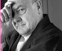
The Alan Fletcher exhibition at Design Museum in London finishes on 18 February 2007. I would recommend in the strongest possible terms that anyone connected with visual communications visit this outstanding show. I think it was organhttp://www.blogger.com/img/gl.link.gifised before his death in September 2006 but it has become a more poignant reflection on his career, his time in Spain, Italy and New York and indirectly the rise of the Design Agency.
As one of the Godfathers of graphic design in the UK, being a founding father of Pentagram, he has been responsible for some timeless work over the past 40 years. (The Reuters logo looks like it was produced yesterday, not in 1965). He always maintained a at the world around him, often using a pen or a pencil in the final artwork, and his work retains an authenticity which seems to be missing from much graphic design in this century. The calendars he designed, often with little more than a few lines and a dash of colour, were indicative of the simple wordplay (and fun) he reveled in.
As a lazy father I was extremely envious of the models he created with his grandson whilst on holiday, and it was fascinating to see his studio/home in Notting Hill so full of energy and ideas. We spent our journey home discussing open plan live/work apartments....
Other than the work, his legacy includes the book 'The Art of looking Sideways' which was published in 2001 by Phaidon. A book with out any linear structure, it groups quotes, emphemera and ideas in broad categories such as Noise, Mutation and Taste. Possibly the ultimate volume of inspiration, it is initially difficult to get to grips with the informal structure. But once you understand that you don't start at the beginning, it slowly unfolds it's treats - questioning the notion of Europe and America being positioned geographically 'higher' than Africa, and therefore creating a visual representation of the world upside down.
Be quick, it may change your life.
Monday, November 27, 2006
Robert Altman 1925 - 2006

A absolute legend in cinema, and particularly a more fluid and improvised approach to film making.
He directed films like The Player, Short Cuts, Mash, Pret a Porter and McCabe and Mrs Miller taht are incredibly inventive in both style and technique - I remember being dazzled by the opening scene in The Player, one long shot that weaves itself through the forecourt of a film studio to enter the producer's office through a window. And ironic to boot. A great film.
I read a quote many years ago which I try to uphold every day in my work, something like; 'How can I create something new if I can imagine it before I shoot?' He then gives the actors space to improvise around a loose script, similar in style to Mike Leigh.
A sad day.
Robert Altman 20.2.1925 - 20.11.06
Sunday, November 12, 2006
Follow the Red Brick Road
The D&AD Branding Forum took place on 09 November 2006. The speakers were Jon Edge, Director, Edgey - Dana Robertson, Creative Director, Identica - Paul Hammersley, Partner, The Red Brick Road - Glenn Tutssel, Executive Creative Director, Enterprise IG.
Each speaker was given 10 mins to discuss Branding over the past 25 years and they all chose to highlight their Hero brands (Apple featured on more than one list). Jon Edge rattled through 200 slides, Glenn Tutssel concentrated on the tv advertising by the big brands like Guinness, and Dana Robertson touched upon the rise of the 'lunchtime brands' like Google and MySpace. But I was particularly impressed by Paul Hammersley. Whilst the younger speakers tried too hard to make a splash, his more stratgic view, delivered by 'the accounts guy', was measured and knowledgeable. He simply knew the subject, and I was hooked.
Paul's principle point was in making a distinction between a Brand Positioning, and a Brand taking a Position. A Positioning is relative i.e. 'we are going to make this product the cheapest on the market'. However the more successful brands take a Position, one that ignores the trends and the competition to create an emotional resonance with the customer. Innocent drinks is an example of a brand that has very clearly taken a Position and which it communicates through all the different touchpoints, from packaging and advertising to cultural behaviours.
A lesson that you don't need to shout, it's just what you say.
PS In the Q&As, someone made an interesting point about the absence of any of the tobacco brands in any of the presentations - Silk Cut, or Benson and Hedges would have made most top Brand lists 20 years ago. A Brand is of course owned by the customer, not the company, and social or political events will have the ultimate say on a Brand's longevity. I quietly applauded myself.
Shelves of food
A recent D&AD Branding discussion was held at the Museum of Brands, Packaging and Advertising in Notting Hill, a building I admit I had heard of without really registering what it was. I scooted around before the event began (the free bar would greet us at the end of the exhibits) and immediately regreted it. There are shelves upon shelves, from ceiling to floor, of packaged goods, all arranged chronologically into decades, as well as posters, toys and other merchandise. The exhibits are crammed into each glass display but not to the detriment of being able to appreciate each item - it's fascinating being able to compare so many products at a glance, and being able to understand their historical context. After all, that is how they were intended to be displayed in the shops. Well worthy of another, more considered visit.
It's been repeated many times, but I still find it interesting how the concept of a 'Brand' has evolved over the past 20 years or so. When I was scampering around at the feet of my mother, a Brand was the name of a product, generally bought from a grocery store. I always found it difficult to understand the difference between, say, Unilever the company and the products they sold such as Surf or Comfort. Surely I was buying a product from a company? So why is their logo not on the front of the box (Or why is it so small?) Don't even start when I found out the same company owned two different Brands that were competing with each other. I can now differentiate between the Business and the Brand, but the term has come to mean so much more. Services are Brands. People are Brands. Invisible or virtual products are Brands. It is a phenomenon that will continue to develop exponentially in this century as brand value and emotional kinship becomes more important to a consumer than the mere product itself. Businesses are having to find new ways of influencing consumer behaviour as the traditional one-to-many marketing channels (such as atl advertising) are losing some of their resonance - consumers are making buying decisions via 3rd party sources.
Gone are the days when a brand was a soap powder, and my brand allegiance was formed in the middle of Coronation Street.
It's been repeated many times, but I still find it interesting how the concept of a 'Brand' has evolved over the past 20 years or so. When I was scampering around at the feet of my mother, a Brand was the name of a product, generally bought from a grocery store. I always found it difficult to understand the difference between, say, Unilever the company and the products they sold such as Surf or Comfort. Surely I was buying a product from a company? So why is their logo not on the front of the box (Or why is it so small?) Don't even start when I found out the same company owned two different Brands that were competing with each other. I can now differentiate between the Business and the Brand, but the term has come to mean so much more. Services are Brands. People are Brands. Invisible or virtual products are Brands. It is a phenomenon that will continue to develop exponentially in this century as brand value and emotional kinship becomes more important to a consumer than the mere product itself. Businesses are having to find new ways of influencing consumer behaviour as the traditional one-to-many marketing channels (such as atl advertising) are losing some of their resonance - consumers are making buying decisions via 3rd party sources.
Gone are the days when a brand was a soap powder, and my brand allegiance was formed in the middle of Coronation Street.
Monday, October 30, 2006
Splash of paint
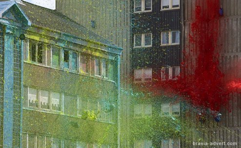
Without wishing to add to the hype surrounding Sony Bravia advertising, the sequel to the bouncing balls is now at a tv near you - and spectacular it is too.
'Paint' features a tower block in Glasgow exploding in a rainbow of colour, fired up into the sky like a firework show in daylight. A clown is seen sprinting away, the apparent culprit for the mess.
The hero is the rich colour tapestry that you would no doubt see through one of the Sony tvs. It's impressive but not to the extent I was hoping - the first explosions are a bit wimpy, and though I apppreciate the concept and the technical challenges, the end result doesn't quite live up to it. The final shot of the paint gently falling on the playground just looks too 'post production'.
The agency responsible Fallon has made great pains to communicate that the shoot was ecologically sound - the 70,000 litres of paint were environmentally friendly and non-toxic, the building was to be demolished anyway, and a team of 60 cleaners were used over 5 days to scrape the water based paint off the the swings, slides and concrete below.
'Paint's predecessor won tons of creative awards, and this one looks like its geared up to repeat the feat. It is directed by film director Jonathan Glazer, who has directed Sexy Beast with Ben Kingsley and Ray Winstone, and Birth with Nicole Kidman. He has also directed some truly inspirational music videos for Massive Attack, Jamiroquai and Unkle, and the 'Greatest British Advert of all time', the Guiness surfers.
It is also the first British ad to be broadcast in High Definition (as it should considering it is advertising HD televisions). But what is particularly interesting is that there is a microsite on the ad itself, its making, an image gallery and an area to post your comments. There are over 370 versions on YouTube alone. A Marketing Director's dream...
Thursday, October 26, 2006
The shape of the BBC
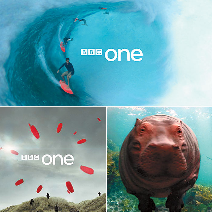
At last! The new BBC one indents have begun to be broadcast from last weekend - at a reported cost of £1.2 million. The old ONE has also been replaced with more friendly, all lowercase, one that sits slightly uncomfortably next to the same BBC logo. The indents feature a variety of subjects, from swimming hippos, surfers to children playing in a meadow. They subtly echo both the 'O' of one and the old globe motif through a symbolic circle that concludes each one. They have been created by Red Bee Media.
I have to say that the tango dancers and wheelchair basketball had been irritating me for some months so this comes not a moment too soon. Unfortunately there are only eight in the new series - so I am sure it will be only a matter of weeks before I will be as bored with these as I was with the previous collection.
PS Apologies for the long wait between posts, ridiculously busy at work but that is really no excuse in the blogsphere.
Thursday, July 13, 2006
The last World Cup posting - until 2010
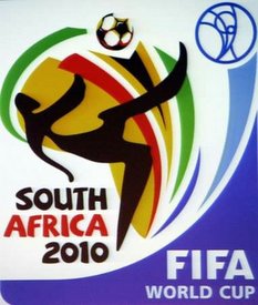
Following on from my earlier post on the emblem for the World Cup in Germany, the logotype for the South African World Cup in 2010 has just been released. Early feedback is not fantastic - the football seems to be taken out of a different project entirely. But to me, it does seem to reflect the culture of home nation through the colours and type, even if parts of it seem a little crude. It was created by a local agency called Switch Design.
Monday, July 10, 2006
The other World Cup in Germany
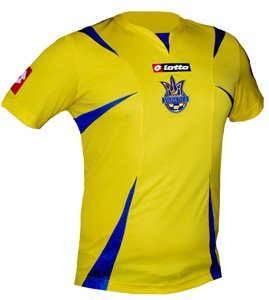
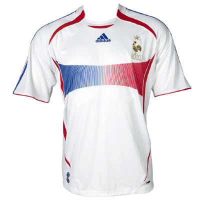
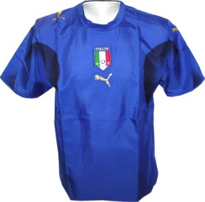
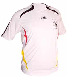
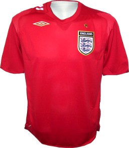
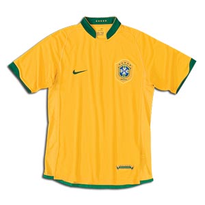
Whilst the same old giants of football fight it out again, there is also a mighty battle between the sports manufacturers on the pitch, each trying to gain valuable equity with the (average) 60 million viewers per match across the world. The brand warhorses Adidas, Nike, Puma and Umbro all have a strong presence an the kits - the Puma emblem is almost as large as the Italian badge, and also appears on each shoulder. The kit design has been relatively subdued compared to recent competitions, the only real exceptions being the French away kit, and the Ukraine kit with the claw marks rising up from the shorts onto the shirts. This sense of discretion may be reflective of our fashion desires, but I suspect that it is so that there are no ugly graphics to distract us from the logotype. If it also helps us to see who is is playing, all the better.
Well, who won? Brazil (Nike) are the top box office draw, and they appeared in three of the top four viewed matches of the early rounds. The home team Germany (Adidas), against history and form, became a popular 'second' choice team with their surprisingly positive football, only to be defeated in the semi-finals. England (Umbro) underachieved again. Italy (Puma) have probably the most beautiful kit, mainly because it's worn by the uber-cool Italians. And they actually won the competition, which Puma must hope stands for something, as that oversized cat will be seen on news front pages from Equador to Australia. The battle will now just be transferred back to our high street until the next sports competition…
Monday, June 26, 2006
Celebrating Faces Of Football
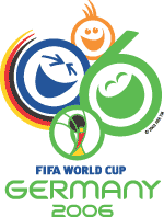
Ever since I saw it for the first time in 1982 , the World Cup emblem has been an important part of the build up to the greatest sporting event in the world. It makes the event seem more tangible as it has been (literally) years since the host country was first announced - but is the cause of my butterflies in the stomach, my sweaty palms at the thought of missed penalities and opportunities. More importantly,the emblem should also be instantly recognisable worldwide whilst being a reflection of the host nation, the spirit of the only truly global sporting competition that also the brand image of FIFA, the world governing body of football.
For the 2006 World Cup, the emblem was designed by London agency Whitestone and incorporates the german flag, the date, a vision of fun and inclusivity, and the emblem of the last World Cup in Korea through the Cup itself.
The events organiser says "We wanted to whet the appetite for what will hopefully be an upbeat FIFA World Cup. Our goal was to convey, via a symbol, the incomparable emotions that can only be evoked by football."
Unfortunately, one of the worlds greatest designers, who also happens to be German, isn't impressed. "First, there are too many messages. The original brief was: we've got to fit Germany in there, then 2006, then FIFA, plus we've got to have some happy people in there, we need green for the lawn, we've got the German national colors. So there's green and black and red and yellow and happy faces and FIFA, just way too many messages. You can look at this and count the elements and it just flies in the face of effective communication." says Erik Spiekermann, founder of MetaDesign. "Don't give up your day job" is his message to the designers. Harsh words indeed.
For me, I am little disappointed and agree that there are too many elements, and the cartoon faces are a little superficial and trite. The german colours seem to be just bolted on as an after thought. Germany has a fantastic tradition in graphic design and the arts, and I guess that Spiekermann is frustrated that it doesn't follow in those fantastic footsteps. But maybe that's because it wasn't done by a German agency...
Monday, June 12, 2006
A brand to believe in
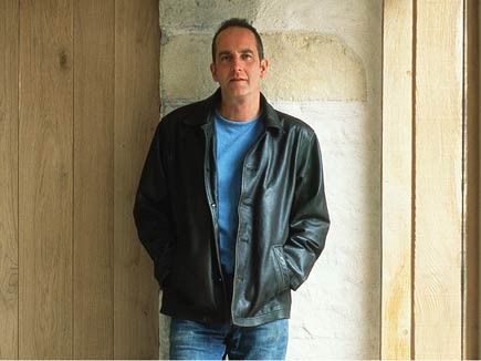
As I wandered around the Grand Design's show at ExCel last week, I realised that this TV programme on modern home follies had evolved into a fantastic brand, and that it had me hook, line and sinker.
Like Apple, it's a brand that can do little wrong in my mind, and I want a little piece of the dream it dangles in front of my 30-something nose. Hundreds of exhibitors, such as Huf House were all there to grab some of it's brand equity for their their own products and its a relationship thatseems to be beneficial to both parties.
The image of presenter Kevin McCloud hangs heavy over the event - it appears twice on the massive entrance banner alone, and on the day I attended, he was also chairing two open seminars. Grand Designs know he is critical to the brand's success, just as Chris Tarrent is to 'Who Want To Be A Millionaire', and Alan Sugar is to 'The Apprentice'. But while WWTBAM offers the ultimate dream, once you take it out of its original context of TV and it loses most of its resonance - the board game is nothing more than that. By being (a little) more obtainable and investing heavily in McCloud's charisma, the Grand Designs brand has been extended to different media, like the show and the magazine, and be made stronger and stronger.
I know little about the success of Martha Stewart's broad range of products in the US, but it's a model that is being increasingly used in the UK - the power of the celebrity. Grand Designs is not named after its charismatic presenter, but it might well as be as I am hooked.
Subscribe to:
Posts (Atom)


