Monday, April 12, 2010

Give it a rest

Just days prior to Tiger Wood's heralded return to golf at the Masters, Nike released their latest commercial featuring the troubled superstar. The hoopla that surrounded his dethroning and his now his return has been strange to say the least as a professional career in the spotlight has been used to rebuild his battered brand - press conference to apologise, press conference to announce a return and now a swiftly produced ad to apologise again… via his late father.


A lot was made of his loss of endorsements from Gillette etc, and this is obviously a (clumsy) show of support from his most significant backer. And in fairness, his return at the Masters was excellent - no dream win, but still a tied 4th position. Yet it is still way too early to crudely don the Nike baseball cap, no matter how sorrowful your eyes look. Suffice to say there are already countless spoofs on YouTube, it's too easy to parody.


Wednesday, October 21, 2009

2012 pictograms


The proposed pictograms for the 2012 Olympics have just been released, and seems to have raised quite a few opinions, if the number of comments on Creative Review's blog is any kind of guide. There are two versions, a silhouette and a 'dynamic' version, apparently inspired by the London Underground map though to me, the more than generous nod is towards the identity itself. Of course it's easy to knock, and many, many people have criticised the Olympic brand identity, but, to add to the noise, I wrote the following on CR;
'The dynamic versions are interesting and could be quite memorable but the 'plain' version just smacks of compromise. Too much detail and manner, combining to create an overly stylised infographic. At a guess, the dynamic version came first. Too many stakeholders, but it goes with the territory.'
The old ones always seem to look better, see Munich 1972. Call it nostalgia if you will, but there's just more soul.

Wednesday, October 14, 2009

Popeye


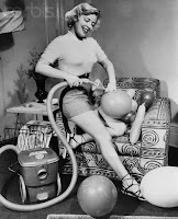
What with the Brooke Shields furore at the Tate and Jeff Koons recent show at the Serpentine, Pop Art has hit London. The Koons show (sadly now finished) was hugely intriguing, his trademark juxtaposition of the banal and everyday, the crafted and the manufactured. Children's inflatable toys float, captured and entwined with metal and plastics, the nearby sign being the only suggestion that everything is not as it initially seems - the toys are actually anodised aluminium. You don't believe it - every crease, fold, valve and type is faultless, so the urge to reach out and touch, to be sure, is contained only by the hovering gallery staff standing next to each piece. As such, the experience becomes frustrating yet remains fascinating, as smiley rubber rings, try to escape rusty 8ft industrial fences they connect with. A typically shallow Koons experience that sits with you for a long time.


Friday, October 02, 2009

Somtimes true...


For all my clients out there, don't be insulted, this isn't about you. For all those pitchers out there who have used the phrase 'foot in the door', this is for you. Hilarious.

Friday, September 04, 2009

It's what you leave out that counts


Been a fan of Noma Bar for a while - his illustrations for Esquire are fantastic, clever, witty and apt, and I would love to commission him soon. He has a new book out called 'Negative Space', a philosophy I have been advocating for some time - see www.equiniti.com for a brandmark we created and an excellent example of a marque and name in union. The Fedex logo is probably the most famous, if under the radar of most consumers. Check him out.

Flatpack typography

Read yesterday that Ikea is globally replacing their existing brand font futura with verdana. It seems the cost of purchasing all those licenses is prohibitive and as the microsoft endorsed is ubiquitous, it will be easier to implement. If ever there was a case study for the importance of type in a brand visual language, this will be it. Gone will the modernist vision, replaced with a blander articulation. Where's the personality?

Wednesday, September 02, 2009

Subservient chicken


This made me howl, closely followed by 'how did they do that?'

Tuesday, September 01, 2009

Heave!


Quite like this - was a bit ho hum with the animation initially (Incredibles like) but the idea brings the film together at the end. Animation by Nexus Productions.

Wednesday, August 19, 2009

Sharpen up


Continuing my love affair with all things Mad Men and 50's based - build a Don Draper in your own image!

http://www.amctv.com/originals/madmen/madmenyourself/

Wednesday, July 15, 2009

Art and nature intwined


Popped into the 'Heaven and Earth' Richard Long exhibition at Tate Britain at the weekend. Had children as company, so it was bit of a whirlwind, but really enjoyed what I saw. When I was at art college, he was often referenced as being an exciting 'natural' artist, and his 'A Line Made By Walking' from 1967 was a fresh approach to sculpture, and performance art. He is probably most famous now for the sculptures he makes on long walks, geometric shapes formed from natural objects unique to the specific environment he is in. I was more interested in the typographic works, in which he simply states the objective and subsequent visual references of long walks, represented in Gill Sans, and mostly just in black and red. Very English, and reminds me of John Betjeman poems, the iconic London Underground map by Edward Johnston and the church posters of designer Phil Baines from the early 1990s. This is no photographic record, no proof of the event, merely a factual record of his experience - through walking according to the tides, or comparing a walk in Devon with one in China, and noting the similarities.


Not at the edge of contemporary art, there is no outrage, just an ethereal presence that stays with you long after you have left the building. Recommended. At Tate Britain until 6 September 2009

'I can see the Gallery from 'ere...'


Passed through Trafalgar Square last week and spent a good while gawping with the tourists at the living sculpture on the empty 4th plinth, courtesy of One and Other by Anthony Gormley. 2,400 people, 100 days, 24 hours, one every hour. 


Part of the intrigue is in waiting to see what each person will be doing for their 60 mins of fame, transmitted by Sky Arts online and tv. I witnessed a young woman wearing angel wings, happily blowing bubbles and throwing balls of tin foil at the crowd whilst shouting through a megaphone, to be replaced by a lady in a long flowing dress who promptly sat down and started reading. Not exactly edge-of-the-seat stuff, but intriguing enough (for a short while at least). It's how Big Brother could be, without the personal publicists, and likewise uncomfortably addictive. You can watch online at www.oneandother.co.uk, and see what each of the 'plinthers' have planned. I was sucked in, and like the other 26,000 applicants, have applied. I will find out on August 1st whether I will be required to strut my stuff in September. Hope it's not a beery Saturday night slot... Think David Blaine and eggs.


What would I do with my time? That's quite a brief. Better start preparing...

Tuesday, April 21, 2009

Drawing on Social Networks...


Saw this cute little video that explains social networking in a simple language that even idiots like me can absorb and understand. I'm always a bit partial to lo-fi scribbles (see the Spinner website). Pass it on!

Monday, March 16, 2009

Don't stop til you get enough


Can the Jackson brand rise again to the heady heights of the 80s? If tickets for his new London show are anything to go by, maybe. The ten initial dates announced at the O2 in London quickly rose to 50 by general sale, and each ticket was sold out in 11 seconds. It may have been twelve years since he last toured in the UK but baby dangling, criminal charges, court appearances and lack of music has done little damage to his popularity. There must be some worries about his performance (and that no body part flies off mid moonwalk), but if he gets it right, it will be some hell of a show. Not sure his merchandise will fare quite as well (who's gonna wear his t-shirt in public?) but when it comes down to it, the product is unbreakable and people will temporarily ignore the circus that is Brand Jacko. Aoww!

Monday, March 09, 2009

Design Week Awards


The book came through the post last week (not invited this year - pah!). Some great work as always. What immediately grabbed my attention was Johnson Banks' Mouse logo (the copyright symbol is just beautiful), Hat-Trick's Scottish Opera logo (simple, classic and therefore timeless), Purpose's christmas promotion for Greenford Press (Pantone + Food = Panettone), The Partners poster for Richard House Children's Hospice (witty and eye catching) and Pearlfisher's packaging for This Water (Innocent derivative in a good way). The digital category was a bit light, no-one was pushing the boundaries, despite what the Lynda Relph-Knight said. It's difficult to be impressed with a site and not by the technology behind it, Flash or video, and good old fashioned ideas are a bit rarer. I guess that's why Eagle Clean was the winner as there is a simple concept but it's a bit ho hum. Design Week doesn't seem to be keeping pace with digital developments.

Monday, March 02, 2009

Morph reborn!


As a subscriber to Esquire, I receive line-free versions of the magazine through my letterbox. Last month, the cover star was not either a most-lusted or most-wanted celeb, but the more understated but not underdressed Morph. He was the star of a fashion shoot, the first time he has been dressed, and his plasticine accessories (by Paul Smith, Gucci, Prada and Hermes, amongst others) were tailormade. The white leather gucci loafers were very cute.

And with Max Clifford like PR planning, he descended onto the Tate Modern for a very fashionable flash-mob to celebrate his mentor, the recently deceased Tony Hart. Tony (sadly without his sidekick, but with his agent) opened my degree show in the mid 90s and drew some pictures which were auctioned off for the college at the end of the private view. We have a frog at home somewhere.

Aardman Animations who look after Morph and Wallace and Gromit have severed their relationship with the Hollywood Sudios that funded films like Chicken Run, citing creative stiflement. Maybe its now the time to relaunch the very English superstar Morph back on our screens, but how long before he will be papped with crack and admitted to rehab?

Monday, February 23, 2009

Going to do the Hoovering


Genericised trademarks are trademarks that were for specific products but have lodged so deep into consumers concious that they are often used for so much more, including a whole brand category. Hoover is an obvious example (being shorter than the more accutrate but cumbersome vacuum cleaning) - but this article is a list from A to Z. Some that you know (Photoshop now stands for any type of photo retouching) but others that are unexpected (Astro Turf, Jet Ski, Microchip). Ford tried to do it with the Ka, but you just can't force it. As usual Wikipedia have an article as well.

Wednesday, February 18, 2009

Twitterings


Just as it has hit critical mass, I (or rather we, our business Spinner) have joined the Twitterers and gone Twittering crazy at www.twitter.com/studiospinner. Great fun, and it's truly reflective of our social behaviours. Short, supposedly sharp, and badly spelt - the noughties in a nutshell. The trouble with so many blogs is that there is this presumption that everyone has the time and inclination to read an essay on your life. We haven't, though I am interested if you can grab my attention for long enough. A twitter does just that, though I can hear Stephen Fry bemoaning the erosion of our language, and he's the greatest Twitterer of them all.

Friday, February 06, 2009

James Bond


Just saw the titles for Quantum of Solace (on DVD) - rather underwhelmed by them. Keeping a balance between the iconic stylism of previous openings and producing something fresh and relevant must be a challenge, but i think they (MK12) failed. Neither sexy, innovative nor exciting. To be honest, I wasn't that keen on Casino Royale either, and there was a time when the titles were one of the most anticipated aspects of a new Bond film (with the new Bond Girls). The song's ok though.

Wednesday, October 22, 2008

Thursday, July 31, 2008

Monkey!!!!!


Jamie Hewlett and Damon Albarn have created three characters for BBC's coverage of the Beijing Olympics. The three characters are based on 'Monkey', a dubbed programme from my youth - BBC2 at about 6.30 if i remember right - and have been animated for the intro sequences. The journey from BritPop to Title Sequences seems to have been relatively straightforward for the ex-Blur frontman. Look forward to seeing them in a couple of weeks.

Sunday, July 06, 2008

Is nothing sacred?

'Designer' is now applied to a multitude of things - from sunglasses to jeans and furniture. It reached a nadir in the 90s as it was so loosely banded around even musicians wanted a piece of it (Design for Life by Manic Street Preachers, Design of a Decade by Janet Jackson). But even with the glory that design seems to bestow upon any product, I am bemused with a new sanitary towel ad - Tampax - that highlights the features by using sketches, blueprints and even the designer themselves. Obviously, I am not the target market, but a quick straw poll in the Sales residence revealed it to be rather over-egging the pudding. All products have to be 'designed' and I guess the agency/client thought that if it works for shavers and toothbrushes, it will work for sanitary towels. But what next? The science of absorbency of toilet rolls? The chemical reactions of shampoo? Er, ok, point made...

Sunday, June 29, 2008

Jump! Quick!


Though I didn't actually witness the ad spot that will change the face of UK tv advertising (damn clients and those deadlines) the jumping skydivers can be seen again on Honda's website - see link above. I imagine seeing it out of context won't evoke the same suspense as watching those guys live doing the difficult within their alloted 3mins 20 secs. However I did receive txt messages from colleagues and family who were literally moved to tears at witnessing history in the making. Most certainly an exaggeration, but advertising will become more targeted, and responding to audience behaviour in real time, much as web 3.0 is promising to do. For example, there is currently a bet365 ad that aired during a break in the European Football Championships which offers odds on the next scorer 'as of 30 seconds ago'. These real-time odds offer a tantalising glimpse of the future. Maybe this is the beginning of the end of the ad epic....

Tuesday, June 03, 2008

Mad Men through and through


This engrossing series finished last week, about the only thing i set a reminder for on tv. Of course I blindly relate to the Creative Director of Sterling Cooper, Donald Draper - effortless charisma, the bravado to turn a client away at an introductory meeting, drooling respect from everyone in the industry and the beautiful suits and accessories (maybe not the adultory). All fiction of course, but the vision of imagining campaign ideas for Lucky Strike, Richard Nixon and Kodak over an afternoon chaser - if only it was that easy - is so romantic and intoxicating, all delivered through a haze of cigarette smoke. Subtlty is key to this programme's success. Sexism is delivered through dry smiles, and the delicious irony is well hidden until the series plays out it's full set of plot twists. Can't wait for season two.